


Seeing your book’s cover for the first time is an exciting moment filled with joy and maybe even disbelief. Why […]
10.06.2024

As a writer, you know the weight of words, how they can affect and shape our imaginations and feelings. In book cover design, the appearance of the word matters as much as its meaning. That’s why getting book cover typography right — the presentation of title, subtitle, and author’s name — is vital to the art’s impact.
As we love to say, typography can make or break a book cover design. Therefore, we want to share typography tips, symbolism, and examples, so your typography always enhances your cover design and never harms it.
When we work on our premade book covers, we always treat typography as an integral part of the final design because of its impact. Besides communicating the title of the book and the name of the author, typography serves the following goals:
Communicating the story’s genre clearly is essential to a premade book cover design effectiveness. Most often, people want a specific type of story when looking for a new book, and the cover art that manages to convey the book’s genre quickly usually gets the cake.
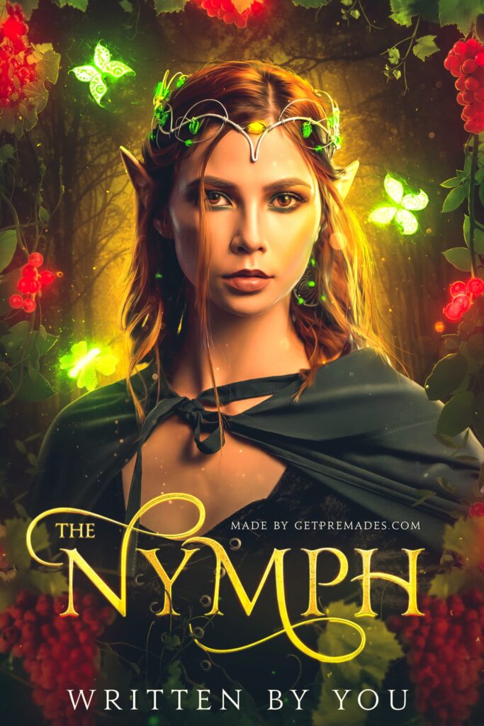
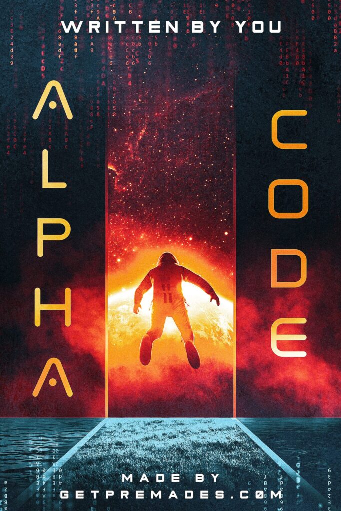
Typography in tandem with imagery helps to emphasize the genre of the book. You can assume the genre of the book by the title alone.
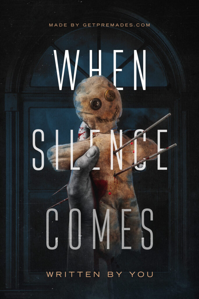
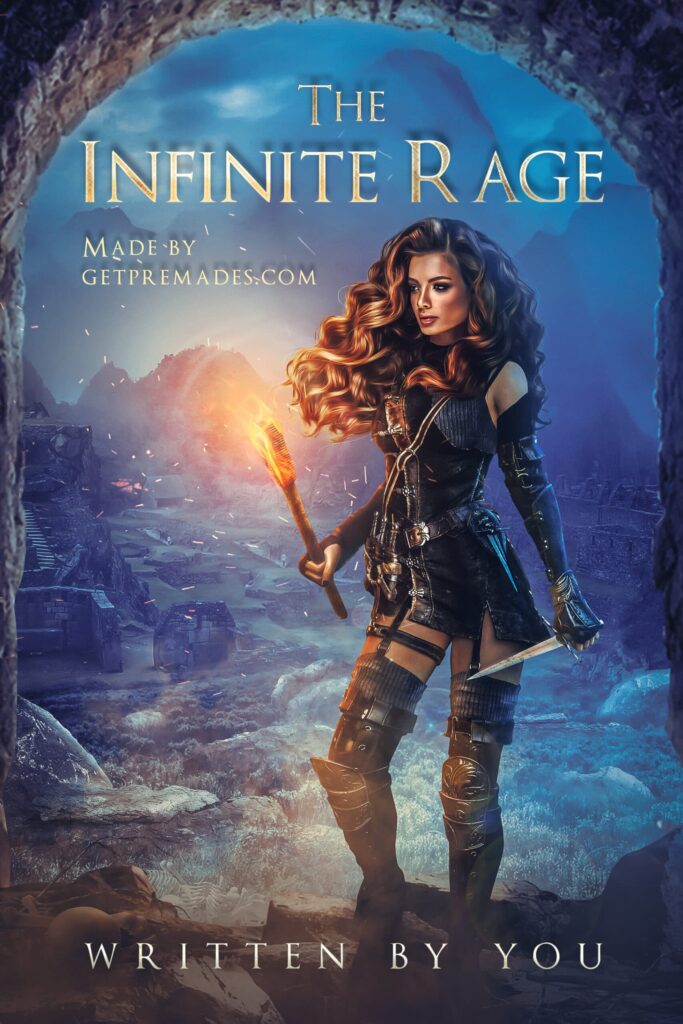
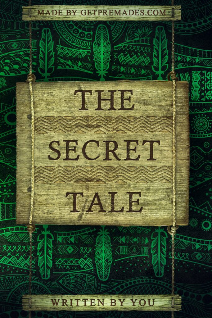
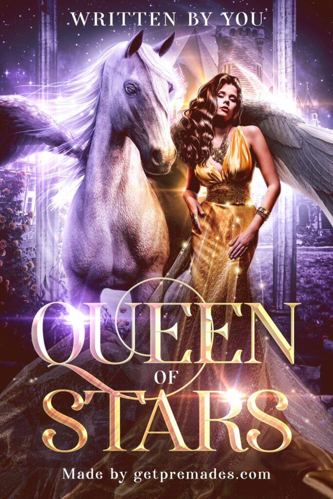
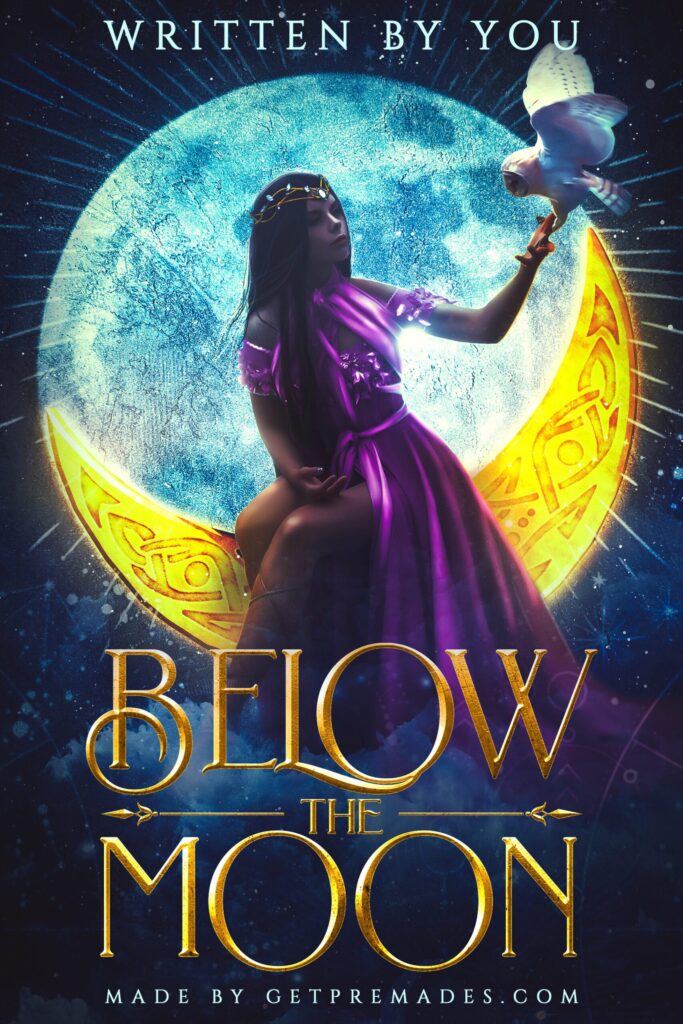
For example

If typography is done right, it becomes almost impossible to confuse the genre of the book when you look at a complete picture.

The color and texture of the font, the spacing and tilt of the letters, the layout of words — everything helps convey the story’s feelings and atmosphere.
Covers without typography feel incomplete, as if they’re lacking that final touch that makes them book covers.
Considering the importance of typography, we need to pay close attention to the text’s font, color, texture, and layout and how they interact with the imagery. Here are a few book cover typography tips to help you better understand it.
As you see, a designer can’t just slap text on the cover and hope for the better. Instead, a solid book cover typography needs careful planning of every element.
First, you need to ensure that the book cover typography serves its primary function — communicating the book’s title and your name — well. It means 4 things:
To find that desired genre-match of cover art and typography, you need to find a proper font. For example,


2. Minimalistic thin san-serif fonts are pretty universal and can work for various genres, from horrors to dramas, romances, and even SF&F.
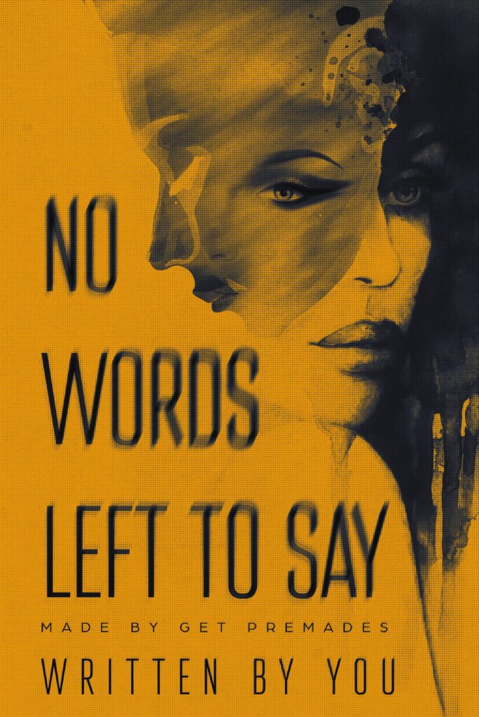
3. Minimalistic thin serifs — though they also seem pretty universal — are more capricious because of their tiny hooks at the end of letters. So, they are often left for books with more loud art, which usually hints at the supernatural, magical, or fantastic.
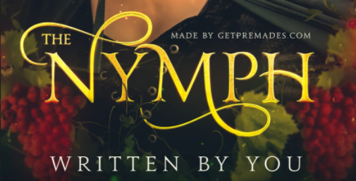
4. Lush, round fonts with curves and ornaments are suitable for romance and fantasy.
But remember that those aren’t universal examples. You need to approach font selection on a case-by-case basis. For example, not every fantasy cover will work well with an undoubtedly charming and fantasy-like Beyond Wonderland font.
Besides, sometimes existing fonts can’t satisfy the book’s demands. In this case, you need a fully custom font.
Book cover typography symbolism comes from three aspects: font style, color, and texture.
A designer will often use a font as it is, without tinkering with letters, size, and space. But, sometimes, you need to customize the font to achieve the required effect or ensure that the text fits the cover art smoothly.
Here are a few tips on how text customization may affect its meaning.
Overall, there are no complex rules or limits to how a person may interpret a text’s presentation in the context of book cover art. Usually, a designer needs to experiment with typography to find the desired result to make the book cover justice.
A proper color is vital to the text’s emotional impact and a nice contrast to make said text legible. Finding a hue that serves both purposes is what designers strive to achieve. The emotional weight of color changes from culture to culture.
Some of the following associations may ring true for you if you’re coming from a European/American cultural background.
On the other hand, book cover typography is used to make the text seem more like a part of the art or give it the sensation of touch.
Applying texture to the text is a tricky balancing act: How to make it seem like an integral part of the art while maintaining its legibility and visibility?
As a result, the process seems much more like drawing — you need an excellent sense of color, shape, and contrast to pull it off. Please take a look at these book cover design examples to understand what we mean.


When you arrange all the elements of typography — layout, font, color, texture — properly together into a single neat construction, the text becomes a little visual story in and of itself. And by simply looking at the text, you start feeling the breath of the steppe wind from the fantasy cover, shivering from the tension of suspense from a thriller cover, or hearing the clashing of swords from a historical drama cover.
Book cover typography is an art and craft that requires hundreds of hours to master. This is because it’s impossible to put all its intricacies into words. Besides, in this case, it’s better to see a single time than hear a hundred. So if you want to see more examples of how masterful typography elevates book covers to the next level, check out our catalog.

Seeing your book’s cover for the first time is an exciting moment filled with joy and maybe even disbelief. Why […]

As we wait for Valentine’s Day, why not talk about thematic book cover design? Moreover, we have something special for […]


Would you like to know more about the writing routine and secrets of the successful indie writer? We know you […]